OASIS Diaries #6: Our Rebrand Story

Hello Natives!
It’s time once again for OASIS Diaries! This time, we’ll be taking a look at some of the recent changes that you guys have just seen.
Were you guys surprised by the big reveal of Oasis v2? Our team has been working for quite some time to prepare for this release, alongside the OASIS Vanguard PVE feature! Not only that, but we did a total rebrand of ProjectOasis as a whole. From our logo, to our new Oasis boy, to the whole look of our Metaverse.
In our sixth entry of OASIS Diaries, we’ll be taking a look at our rebranding process.

Logo Redesign — From Old to New

Oasis began with a simple dream. To create a safe haven for people to explore, socialise and participate in Web3 and DeFi. Fun, friendly and simple. Our previous logo reflected those aspects. It was simply the head of our original Oasis boy with the word “OASIS” below.
Spreading Our Roots
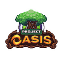
But as we built Oasis, our dreams and plans for the future grew. Our new logo is centered on our Yggdrasil tree, which is at the heart of Oasis. Like a tree, we’ve been spending our time to plant our roots firmly in the ground and expanding our network. And now our efforts have borne fruit!

Our Yggdrasil tree has matured further and is given a more futuristic spin! The pulsing, electric cables connected to it are linked to the omni-chain, which is in our current plans for a future expansion to other networks. You will be able to access them once it’s available using the portal located in the interior of the tree’s base.

Logo Variations

Our current logo is drastically different in terms of look and feel compared to the old one. While the old logo was simple and cute, our new logo has more depth, using a higher pixel density and color palette.
The organically-shaped wooden frame gives emphasis on and ties back to the tree in the logo. Earthy color tones still retain and convey our friendly, inviting nature that’s open to everyone.
Evolution of Oasis Boy

Our Oasis boy gained a higher resolution and pixel density. He looks much more dynamic, with lively hair, and expressive facial features. He went through a lot of experimental styles before our final choice.

Map Tileset & Building Redesign

Similarly, our map tileset and all the buildings in Oasis went through an intense redesign to fit into our new aesthetics. Greater depth, added minor details, and a more organic layout of the map.
The loading of the maps and new areas is also much smoother. We’ve also improved user experience of different menus, such as settings, staking farm, and so on.


Oasis Coin (Token)
Are old coins always worth more? Not in this case! Feast your eyes on our brand new Oasis coin below! Worth it’s weight in gold.


Our new coin was carved out in 3D by one of our lead designers himself! The front of the coin depicts our tree with roots and branches spreading out. While the back features the “O” in our new Oasis logo, sitting on a network of circuitry in the background.
